26 July 2007

Light Stepper.


without a foot on the ground, scanned this in and did a messy coloring just to have a wallpaper... and... here it is.. big and for all.
the border is my sketchbook, i like it.

history of america websites update..


Soo... the first version of the History Of America website went live, and then i decided that safari was just being buggy for too many people.... so i wasted like 4 hours of my life to compile the one-long-horizontal-scrolling-page-of-a-beast -- into a multipage-viewable-site-thing. [go look] Also, on top of getting the bugs worked out of the website, we also added a new section for downloads. Head on over to check out the offical History of America Font: Bunny Shaker, some cool wallpapers to adorn your desktop with, and last a clip from the HoA showing the behind the scenes magic (mk12 waving magic wands not shown to keep some secrets)

so? Go now.. what are you waiting for?!

20 July 2007

MK12's History of America Web Sightings (updated twice)


just because internet translations are hilarious.. here is a babel fish translation of the blog post about the Chile screening of history of america:
"No, MK12 is not a Nu group metal, if not that one of the more important studies of motiongraphics of the moment. If they do not have idea of which I am speaking, they see the last Reel of MK12.... They already saw it. Good they are expert in that. And they will be in east Chile Fridays 20 of Julio invited by the faculty of design of the University of the Development. The idea is to do a conference deprived of only 50 cupos, and that they count its experience in the development of its work and your you have time to ask what you want. To attend the event costs $15,000 pesos Chilean (or 15 lukas), to register must call to 299 92 58. The place is in the same faculty of design of the University of the Development, this Friday 20 to 15:00hrs."
{read}

Also featured in a new Kansas City Pitch newspaper writeup, here is a quote of it...
" In The History of America, a rousing and absurd half-hour production from local animation powerhouse MK12, shit blows up just as good as anything Hollywood has offered since Steven Spielberg's War of the Worlds. "
{read}


on this website... Blue Vertigo you can find this awesome long horizontal scrolling sequence of images that i have conviently captured for you so you don't have to go there and click, but i would suggest going and clicking because there is more photos that i didn't capture. Browse to their site, then at the bottom in the 'menu' go to 'PRE TMDG 2007' and there you have it, bigger and better.
{read}


and sighted over at Tomorrow Unlimited... here is another quote from their writeup..
"Four years in the making, History of America is a psychedelic animated film set "against the warm sin of Las Vegas and the cold vacuum of space," chronicling that epic American struggle "between astronauts and cowboys as they fight for life, liberty and justice for all,""
{read}


The Kansas City Star gave us a review, and a writeup on the studio in general...
"The 31-minute film visits the eternal conflict between Cowboys and Astronauts: There’s carnage and mayhem in space and on terra firma, a shootout in Las Vegas, and all manner of recycled pop and movie imagery. An epilogue recounts a kind of postwar, alternate American history, with momentous (if not warped) touchstones involving James Brown, Elvis, something called the Hemingway Doctrine and the Boston Tang Party."
{read}
"I don’t know what the guys at MK12 Studios are on, but I’d sure like to try some of it."
{read}

I'm always digging through our traffic on the website so here is a blog posting on Savedem.ro
{read}


Apparently sexy, here's another blog link from Layer07!
{read}


Making of gets first link via Motionographer... and the first and only comment is the best ever.
{read}

Boredom is your fault makes link of the link of the making of....
{read}


i think thats all the links i can link for now.. whew.. maybe i'll update this again ;)

18 July 2007

the old argument of graffiti..

I remember when i first started painting graffiti, i would always get upset that people didn't consider an art form.. i think i fought and fought to prove that it was until one day.. i realized.. am I fighting a battle that is already over? I think part of me finally realized.. hey i'm still here trying to prove something that people already know.. and then.. i moved on. I just pushed my art forward and kept going. But of course there is still people, still generations, and still closed minded people who will still call it pure vandalism and not art.

"To Montgomery, the graffiti decorating the bridge and rocks is nothing like what you’d encounter in a gallery.

“It may be artistic, but it’s not art,” she said recently, peering down at the bridge from a neglected maintenance trail above Fountain Creek."

my friend recently sent me an article that ran in their local Colorado Springs paper about this big battle over graffiti. I understand there is points where the laws step in and deem it illegal and what not.. but just because it is illegal in some forms doesn't discount it as an art. I'm sure if this bridge wasn't near some sort of nature attraction these people wouldn't give two flips if it was a place where artists painted or not.. but because it's visible.. its wrong, and it isnt art. Meh.. to you people.. it doesn't seem worth my time anymore to sit there and argue with you whether what i do is art or not... i'll just keep doing what i do and move foward.. you can stay in your little box and complain to yourself.


->article mentioned

17 July 2007

a few things of note...

baH! i've been so busy i havent been able to get around to some solid updates... BUT... here a few things to note..

a) The new MK12 website went live... it is quite pretty. So head on over to check out a new reel, some new work, and plenty of things for your eyes to enjoy.

b)The new history of america website launched... stay tuned to it for tour dates of the film showing at festivals and sorts all around the globe. Also new products and special features coming soon! And (cough) i designed it (cough) !!

c)http://designcharts.com/
This is quite interesting, a website I am not familar with BUT! This website is dedicated to bring you a weekly top 40 website design charts... interesting in itself, even more so is that the new mk12 site is currently number 25... yummy. Head on over to design charts to check it out yourself! i'm not a liar..

d)http://www.designenterprise.com/category/cool-sites/page/2/
This caption says a thousand words... ok not really.. it says what it says, but still.. it made me happy because I made that trailer page.. and it has 'smart' and 'design' nest to each other.. it was fun and awhile back but still.. niceeeeeee
stay in tune, i'll be back shortly...

11 July 2007

Division, a beautiful thing..


in a new series that i'm trying to get kicking around the office.. here is my kick off image. i'll explain more of the process behind the collaboration when i get some more images, but for now this is my contribution thus far...

10 July 2007

doodling for conference calls


enjoy... this call was quite chatty, all quotes i promise.

08 July 2007

History Of America Premier


Our premier is over... it went amazingly well. We ended up doing 5 screenings so that everyone who wanted to see it could, even the hard working staff. We thank all of you for coming out, and the art show was such a fun night, and so was the premier... and oh yeah.. the historyofamerica.tv website is up now.. go look. its pretty... i think our new mk12.com site will be up this weekend as well sometime.

03 July 2007

the finger in the computer Part A.


As promised, i've tried to come up with a part 1 of 3 in this 'finger in the computer' series that i have wrapped around in my head.

First... being as shy as I am, this is a disclaimer that i haven't really verbalized or typed in this case, my most recent design aesthetic... but i did want to take the time to sit down and type it out to explain why I use it, and perhaps broadly why I feel it is used (and abused) so heavily right now. With that in mind.. let's get to it.. and if you aren't along for this ride, go ahead and skip this post... it is going to be a book ;)

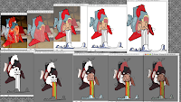
This design that i'm showing for part 1 is a piece i did two years ago. It sucks because the original idea came from a sketch I did but in the process of moving from the old mk12 building to here, I lost the original sketch. But it's important to say that this idea was based in pencil before it ever touched the computer. So in theory - I drew a heart with one of my characters faces inside of it, puking out clouds. My first initial reaction was to go into illustrator and create a clean version of this idea as a base, and if well executed perhaps as the final product.

The first step i wanted to take was bring a real life element into the piece by using a photograph. That way I was somewhat accurate with my heart, and it was a good base to build from. I went to google, typed in heart, and you can figure out the rest. Copy + Paste, got it into illustrator and begin to get the base shapes and form down. After getting all of the details that I wanted out of the heart, I began to lay in my character and get the spewing of the clouds out.

Next i think rather then going through a full process is the explanation of getting from point A to b in more of a conceptual stages, rather then linear process oriented directions. After getting the image pretty satisfactory in illustrator, i realized that it was too 'clean' for me. It didn't have the same affect that my sketch did to me. In order to get there, i felt that photoshop would lend itself to giving me a more hands on direction.

I brought the image in, and chipped away all of the beautiful, clean, solid filled vectors i just created, and just like using the original found image as a base, I used my .ai file as a base to get closer to m concept. I began creating torn edges, and changed my clean 'hand drawn' arrows from illustrator into hand drawn arrows in photoshop. They still weren't exactly hand drawn arrows that were scanned in, but it was close enough to the filling that i was ok with it. After bringing back the original image at this point, i was able to use its color and trace it in photoshop, so that it felt really hand drawn.

Anything to break a solid color or line to me makes it feel more rough. So i took the fat outline that surrounded the piece and erased it with a watercolor brush. I didn't have the vast library of watercolor brushes as I do now, but I like to scan in actual watercolor brushes and use their alpha to create custom brushes. It's the easiest way to get close to the hand in the computer as you can get. It is still digital and manipulate but, you are creating visuals that represent how one would go about creating this as if it were a painting, etching, or printmaking process.

After I got it looking more rough, and grungy, I wanted to bring back elements from the photograph that showed it was a schoolroom model of a heart. I emphasized the hinges, and then wrote numbers on the colors spewing from his mouth and on the cloud as if it was a color by number set.

It was done... it was as close to my original intention of my sketch, but still went beyond it and created more of a tactile image. The last touch that wasn't 100% necessary was adding a fabric texture as a blending layer on top of some of the colored sections. I thought this saturated and textured the meat of the image to give it that collage feeling.

I think through this short process I was trying to explain how the beautiful clean version and the grungy-rough version speak in two different ways. The original finished illustrator document is primary and clean which gives it a light hearted and cartoony feel, since its a really contrasty image, especially with a bold thick outline. While the final image result gives a more tactile, processed image that feels like it has depth, character, and surreal. To me it lacks the smiley-go-happy-pretty-huggable feeling that the vector image portrays, and is able to live in an aesthetic that is unique rather then solid fills and outlines.

While i don't think anything or everything has to go through this process, i'm just trying to give insight to my thinking process and why i feel images are able to go beyond straight forwards imagery. I think that straight forward imagery works in lots of situations but when translating from someone who draws constantly on everything around me, to trying to sketch in the computer, i often run into the feeling of being distant and lack the ability to physically control my digital medium. Being able to use my wacom tablet, scanner, and a digital camera if needed (or the internets) I feel i'm able to bring my hand back into the computer, and bring my digital sketches closer to me.

I have a few more different examples of my process of degrading images in the computer that i think will drive home the point more than a personal sketch, but we'll see.. comments are welcome, and thanks for staying to the end, and reading through my babel / rant - i was never good with words, thats why there are lots of images :)